Micro-Wind Turbine Review & Performance Guide
If you're thinking about buying a wind turbine, one of the most important questions you might ask is,
"How much energy can I get out of this thing?"
In fact, this could be the most important question in selecting a wind generator, yet answering this question is made incredibly difficult by the industry.
We conducted a piece of research into the performance of popular micro-wind turbines to help answer this question. As part of this research, we:
- collected all the popular micro-wind turbine power charts
- digitised them from images to data
- interpolated data to fill any gaps
- standardised reporting
- consolidated the power curves onto a single chart
Then, after looking at instantaneous power metrics, we really wanted to compare energy output estimates in terms of kWh per day. However not all turbines provide energy output charts and when they do, comparing those charts at face-value overlooks the varied range of assumptions that manufacturers could adopt when converting power (for a given wind speed) to energy yield (for a location with varying weather over time).
To overcome this issue, we:
- developed a simulation model of the wind
- applied that same model to all the power curves
- calculated the implied daily energy outputs in kWh per day
- performed a like-for-like comparison on the results
As far as we know, this is the only such resource available on the internet. And it's free!!!
What is a "micro-wind turbine"?
We define micro-wind turbines as those with a diameter of up to 1.3m. You could also think of them as the size range used in marine applications, including boats, yachts, barges, pontoons, etc.
Causes of confusion
What makes evaluation so difficult?
For one thing, just getting used to the terminology and concepts in renewable energy can be tricky for the average person. To many people, power and energy are pretty much the same thing, but in the industry, the difference is stark. Energy is the product of power and time. We measure power in Watts and energy in Watt hours. Throw volts and amps into the mix and we have a recipe for confusion.
Then there is the way information is presented. When turbine manufacturers release the specifications of their wind turbines, they include a power curve chart. It shows how much power the turbine can produce at different wind speeds. Here is an example:
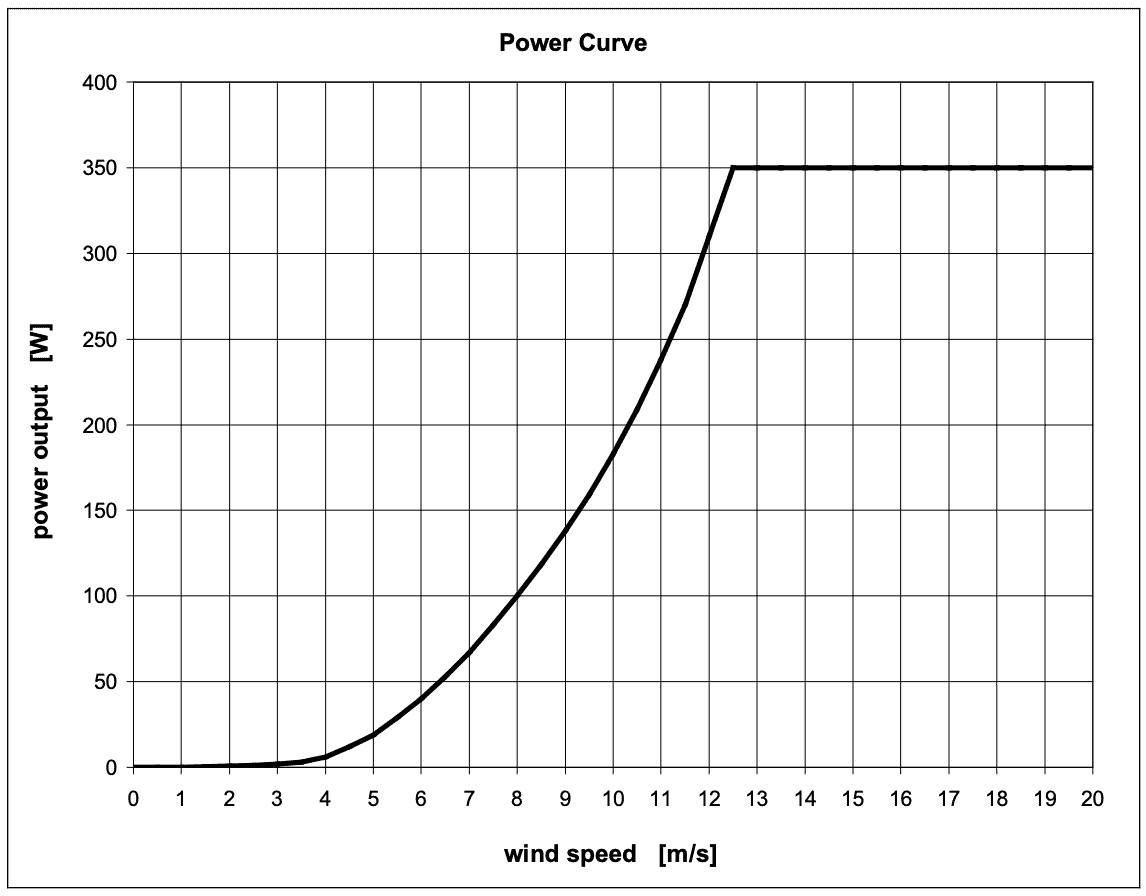
So now we know that this turbine at a wind speed of 8 m/s (metres per second) produces 100W of power (in perfect conditions). What we still don't know is:
- What wind speed should we be looking at?
- How much power is that over the course of a day?
- Or more importantly, will this run my appliances?
Also, we need to be careful because these charts make some 'perfect-world' assumptions about what type of wind is blowing. They assume your 8 m/s is laminar wind flow which means the wind flows perfectly smoothly without any imperfections or disruptions.
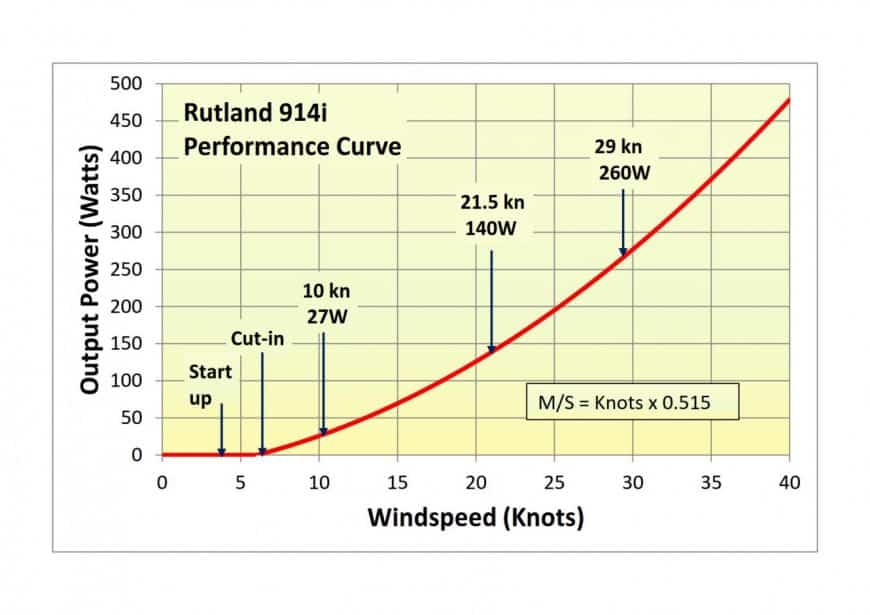
Here is another example from a different manufacturer. This time the wind speed is given in Knots so comparing the two requires some arithmetic.
Some manufacturers like to express the Y-axis in Amps for a given voltage of turbine, further complicating the comparison process.
Others still like to use bar graphs, sometimes even 3D bar graphs.
Comparing Power Curves
Power curves can tell you part of the story and it helps to see them on the same chart, using the same scales.
Firstly, worth noting the size differences:
- Most turbines in the chart are 1.2m in diameter.
- Smallest is the Rutland 914i at 0.9m.
- The Eclectic D400 is 1.1m
In the interactive chart above, you can see a number of things:
- Curve shapes:
- The AIR turbines have peaks in their power curves before dropping off. For the AIR X range, the peak is much higher and the drop-off is more dramatic. These peaks enable the AIR X to be rated at 400W while the AIR Breeze is only rated 160W. When we look at energy outputs, you'll see how irrelevant rated power metrics can be.
- As wind speed increases, the Superwind 353 and Rutland 1200 curves level off around 12-14 m/s but continue generating.
- The D400, Rutland 914i and Silentwind continue to increase power generation as wind speed increases (although Silentwind do not release figures above 15 m/s)
- Zooming in on low winds, we find the Rutland 12000 producing most power between 4-12 m/s. This is outstanding performance from the Rutland, putting clear air between itself and other micro-wind turbines.
- The AIR X range produces the least power from 4-6.5 m/s, ramping up fast to become the most powerful turbine in 12-13 m/s wind speeds, before declining just as quickly.
- Aside from the Rutland 1200, the AIR Breeze and Superwind are the most impressive 1.2m turbines for low wind speeds. While the AIR Breeze tapers off, the Superwind keeps on performing at faster speeds.
Energy matters more than power
While power curves tell you what your system could produce at a single moment in time (with perfect wind), energy curves try to aggregate that power into a measure of what would be produced over the course of a day, week, month or year.
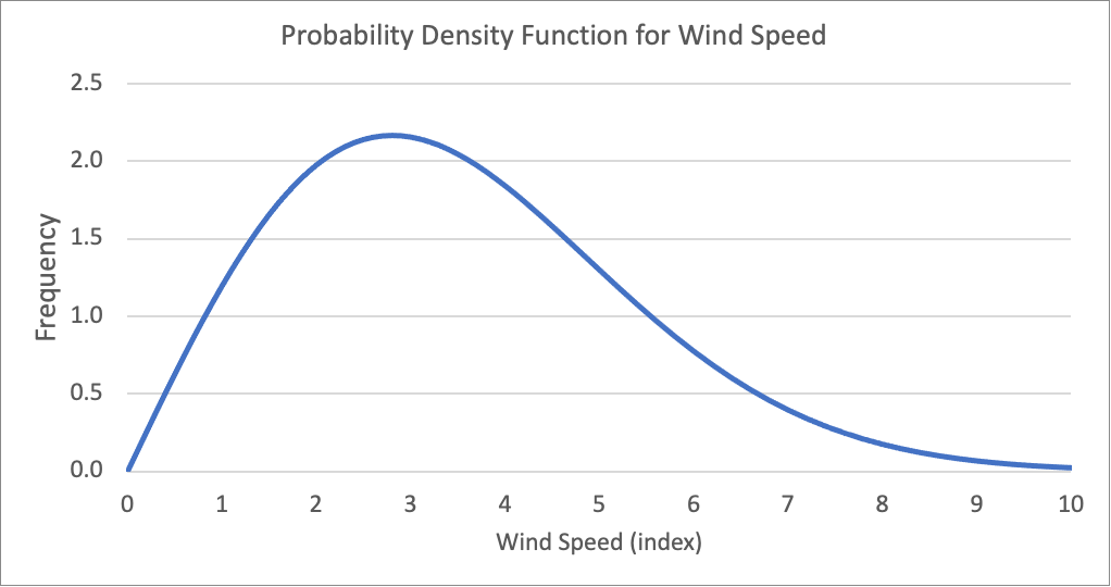 To convert from power to energy, we need to represent the fact that wind speed is a variable which changes over time. If we know the distribution then we can simulate power output for a range of wind speeds based on their probability.
Research on this is well documented and leads to the wind speed probability density function shown here. This chart shows a location where 2.8 m/s is the most common wind speed, but the same shape applies for any average.
Comparing Energy Output
This is the outcome of running our simulation for every average annual wind speed from 2-12 m/s.
As you can see from this chart, the Rutland 1200 produces the most energy for any turbine in our test, for any annual average wind speed above 2.5 m/s. Below 2.5 m/s, the Silentwind Pro is exceptional, and that might be important for owners that need to trickle charge their batteries even while docked in a sheltered marine.
At an average wind speed of 5 m/s (18 km/h, 11.1 mph, 9.7 knots), the top performer generates 1.4 kWh per day on average, while the remainder are in a tight range between 0.75 and 0.93 kWh.
Results @ 5 m/s
Turbine | Output (kWh/day) |
Rutland 1200 | 1.40 |
AIR Breeze | 40 | 0.93 |
Superwind 353 | 0.93 |
Eclectic D400 | 0.91 |
Silentwind Pro | 0.86 |
| AIR X | 30 | Silent X | 0.79 |
| Rutland 914i | 0.75 |
Results @ 7 m/s
Turbine | Output (kWh/day) |
Rutland 1200 | 3.04 |
Eclectic D400 | 2.31 |
Superwind 353 | 2.27 |
AIR Breeze | 40 | 2.01 |
AIR X | 30 | Silent X | 1.94 |
| Silentwind Pro | 1.91 |
| Rutland 914i | 1.63 |
Results @ 10 m/s
Turbine | Output (kWh/day) |
Rutland 1200 | 5.55 |
| Eclectic D400 | 5.08 |
Superwind 353 | 4.19 |
| Rutland 914i | 3.32 |
Note how quickly the output improves as wind speed increases. Going from 5-7 m/s doubles output for any turbine. Understanding your wind speed is essential in deciding on a turbine.
We had to cut short the curves for the AIR X, AIR Breeze and Silentwind Pro, because the published power curves did not extend out further, but it is interesting to note that the AIR Breeze range (rated at 160W) outperforms the AIR X range (rated at 400W) for all average wind speeds. To see this clearly, deselect all other curves by clicking on them in the legend.
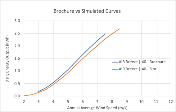
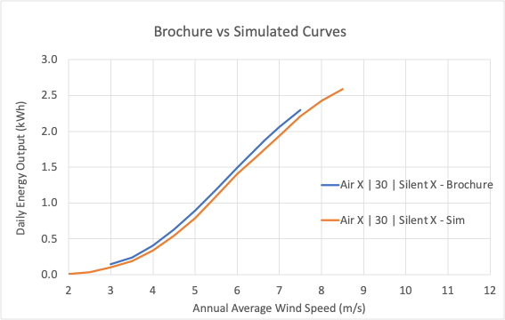
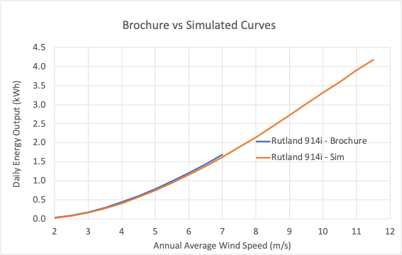
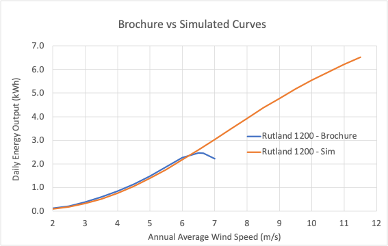
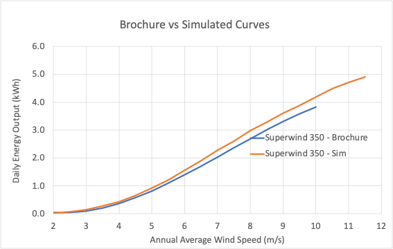
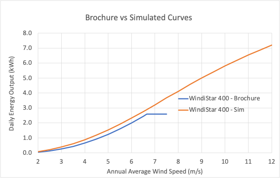
What about energy curves from manufacturers?
As stated above, we didn't use the published energy curves from turbine manufacturers because we could not be confident they were based on the similar assumptions. Although the same could be said of the power curves, there is far less scope for 'creativity' in constructing them and they remain the best information we have.
However, we did perform a comparison of our simulated energy against the graphs from manufacturer brochures. Not only did this help validate the simulation model, but it also gave a read on which brands adopt more conservative/aggressive assumptions.